Code Dot X
ROLE: VISUAL IDENTITY/ART-DIRECION/PHOTOGRAPHY/VISUAL RESEARCH
CODE DOT X TEAM, TAYLOR SIHAVONG
DURATION : 12 WEEKS
2023-24
CODE DOT X TEAM, TAYLOR SIHAVONG
DURATION : 12 WEEKS
2023-24
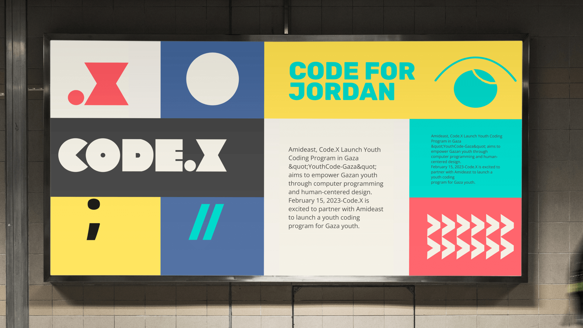
Code.X is a volunteer-run nonprofit based in Silicon Valley that brings high-quality design, technology, and entrepreneurship education to young people in fragile and conflict-affected areas across the globe. Their mission: to foster confidence, creativity, and community through human-centered education.
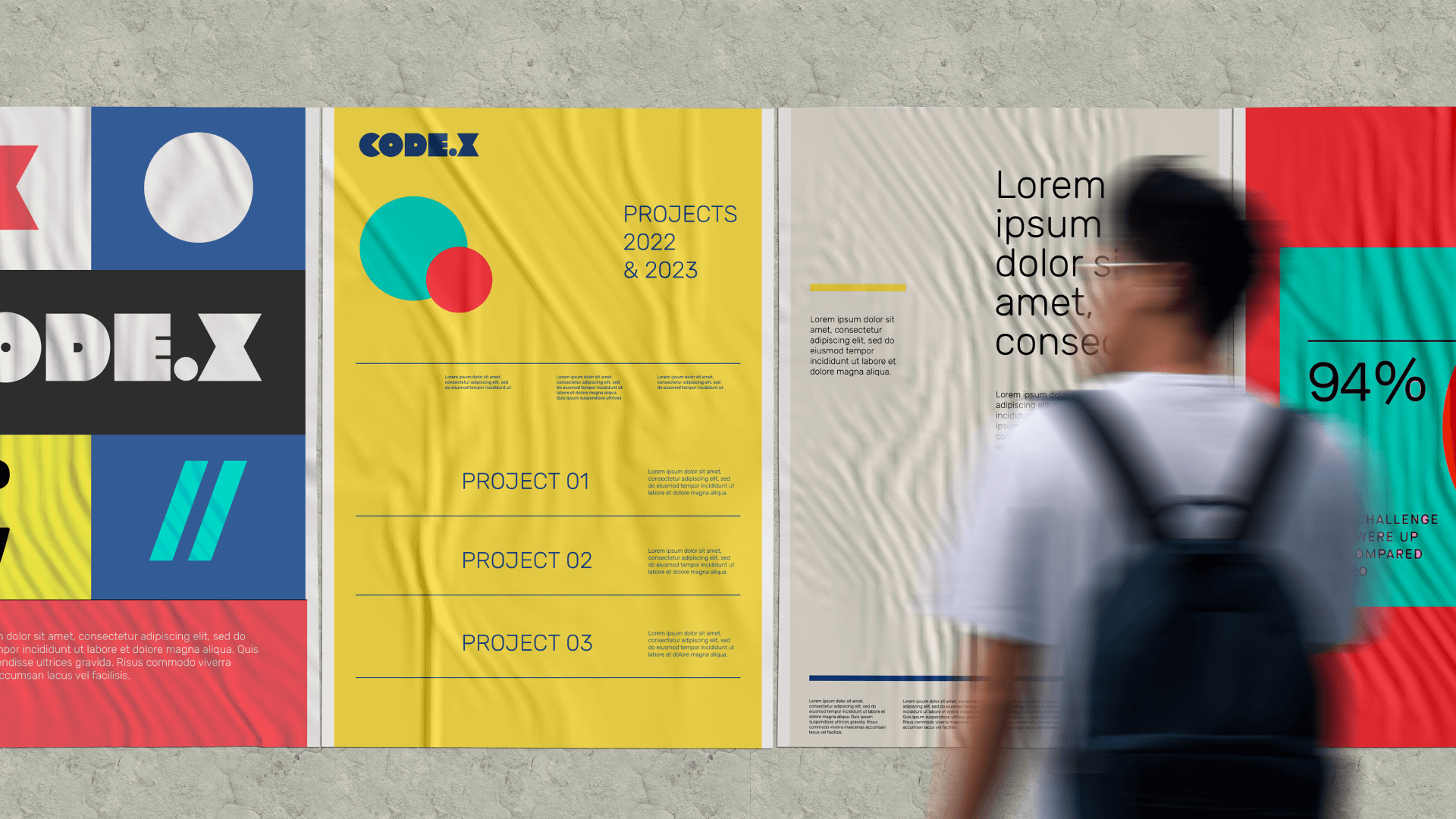
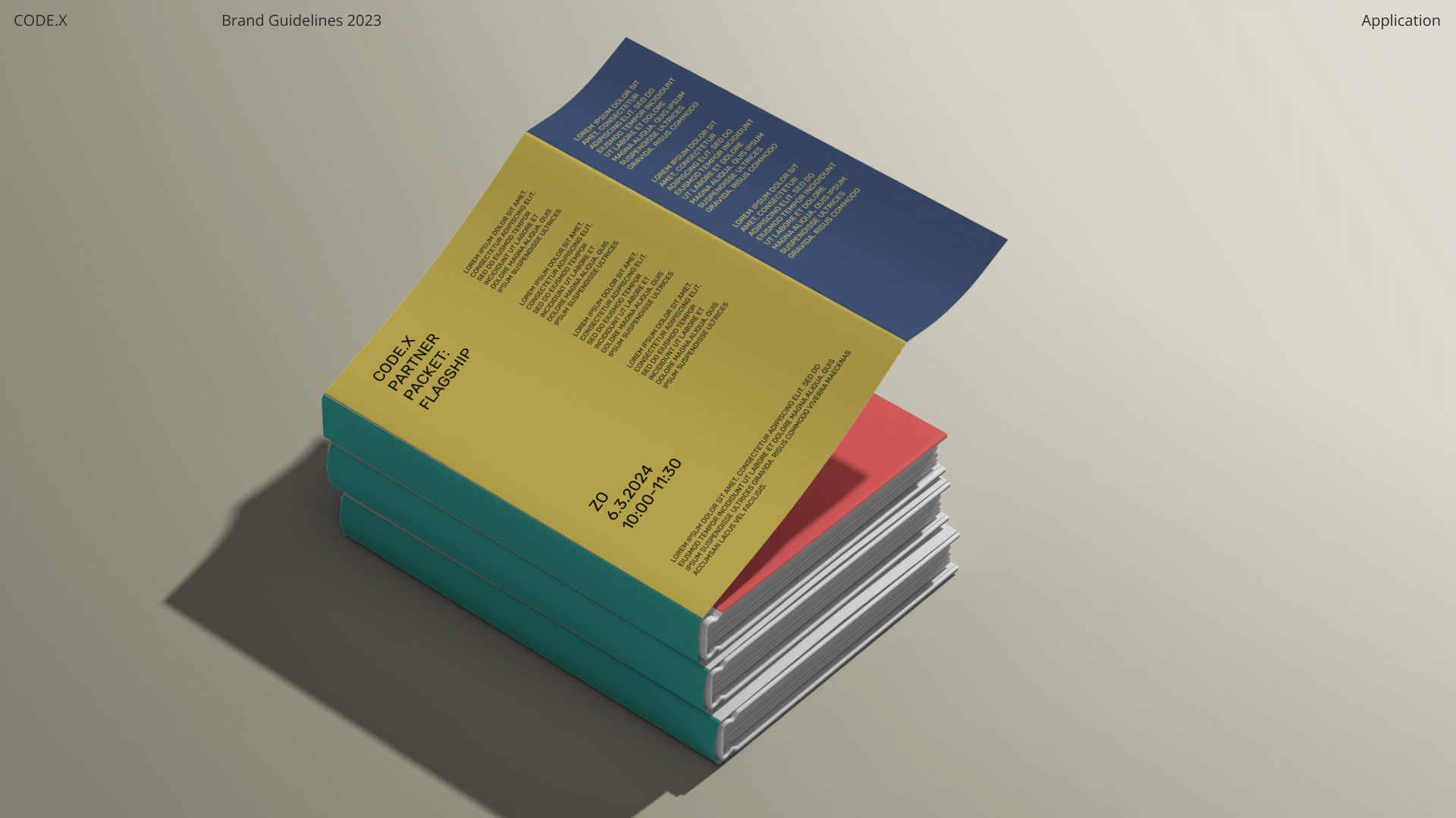
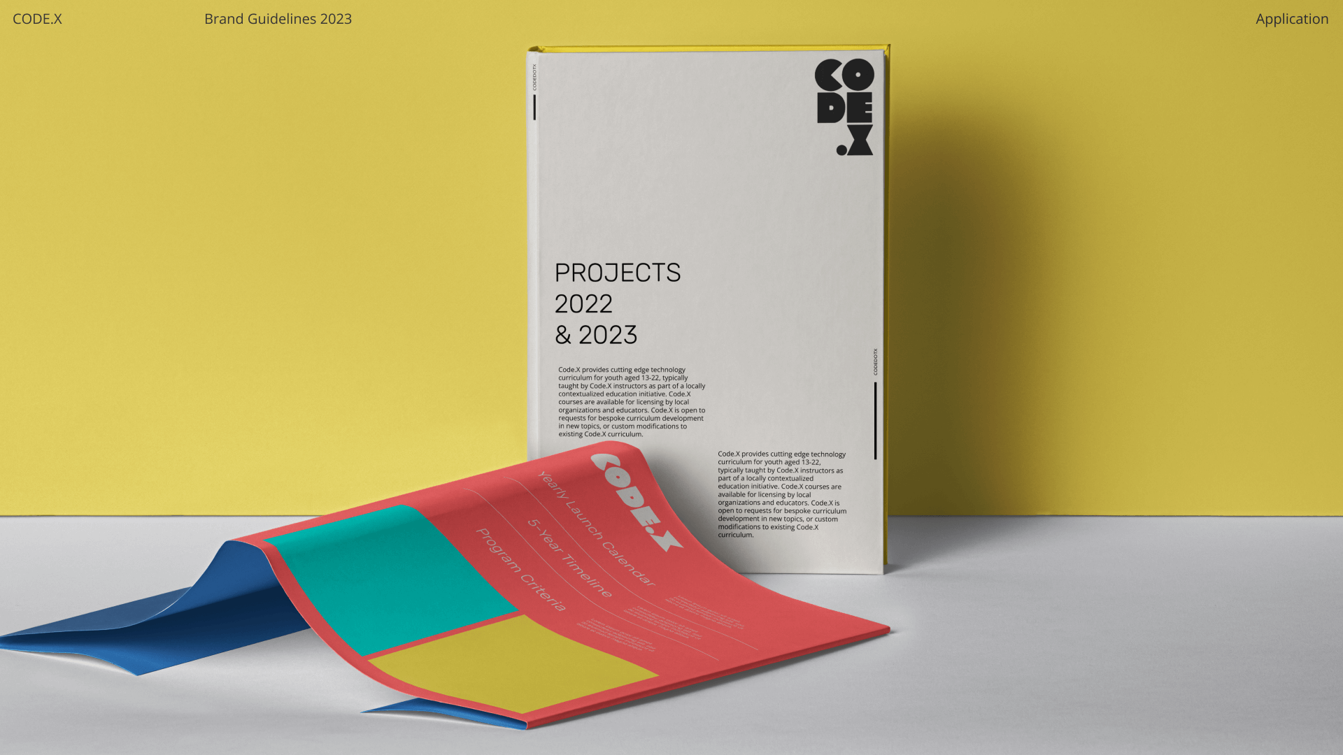
In 2024, Code.X underwent a major rebrand to better reflect its global mission and growing credibility. I led the visual identity design and created a design system that would carry the brand from concept to web launch, establishing both clarity and consistency for its future growth.
In 2024, Code.X underwent a major rebrand to better reflect its global mission and growing credibility. I led the visual identity design and created a design system that would carry the brand from concept to web launch, establishing both clarity and consistency for its future growth.
Problem
Code.X had proven impact and global reach—but its visual identity lacked coherence and didn’t reflect the gravity or ambition of the work being done. As the organization expanded across regions and was featured in Forbes 30 Under 30, it needed a brand and platform that could:
-
Earn the trust of donors, volunteers, and partner institutions
-
Communicate clearly with students, educators, and local leaders
-
Reflect both global unity and regional specificity
- Feel modern, hopeful, and culturally sensitive

Empathy mapping
To begin the rebranding process, I conducted:
-
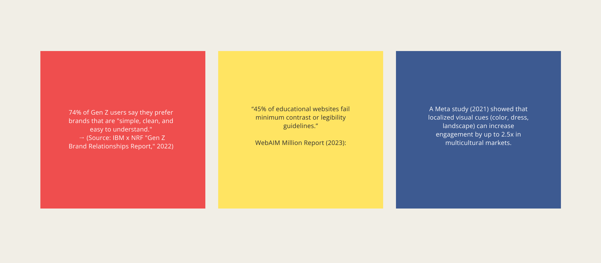
Brand landscape analysis — Examining how other educational nonprofits, youth accelerators, and design-led orgs positioned themselves globally.
-
Stakeholder interviews — Understanding the goals of founders, local instructors, and alumni to ensure the brand aligned with both internal and external values.
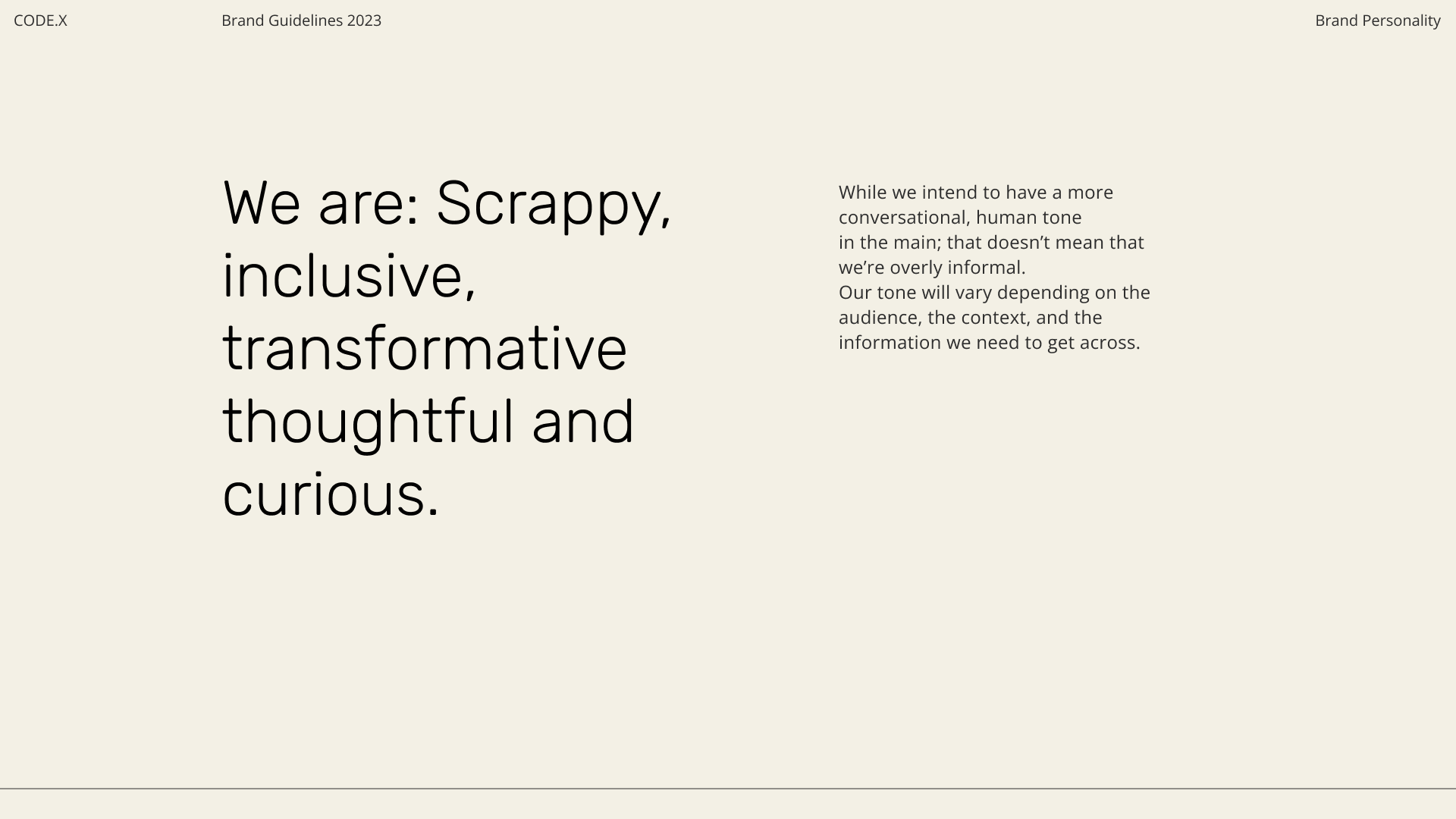
- Tone of voice surveys — Identifying key emotional signals: empowering, bold, grounded, approachable.


Scoping the product
The new brand system was built to be modular, lightweight, and globally adaptable.
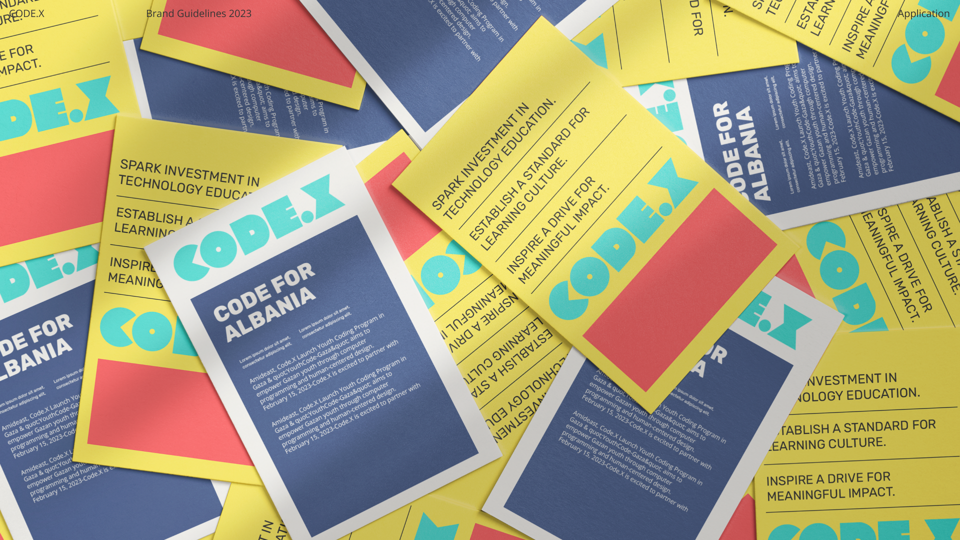
1. Visual Identity
-
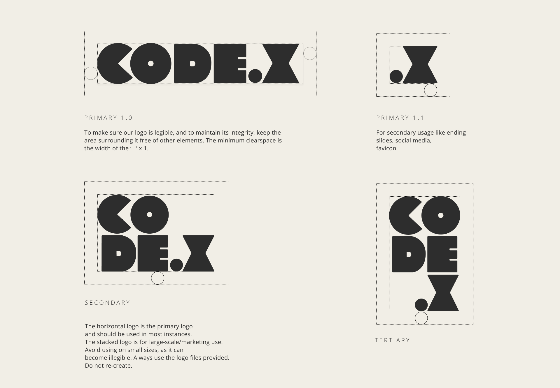
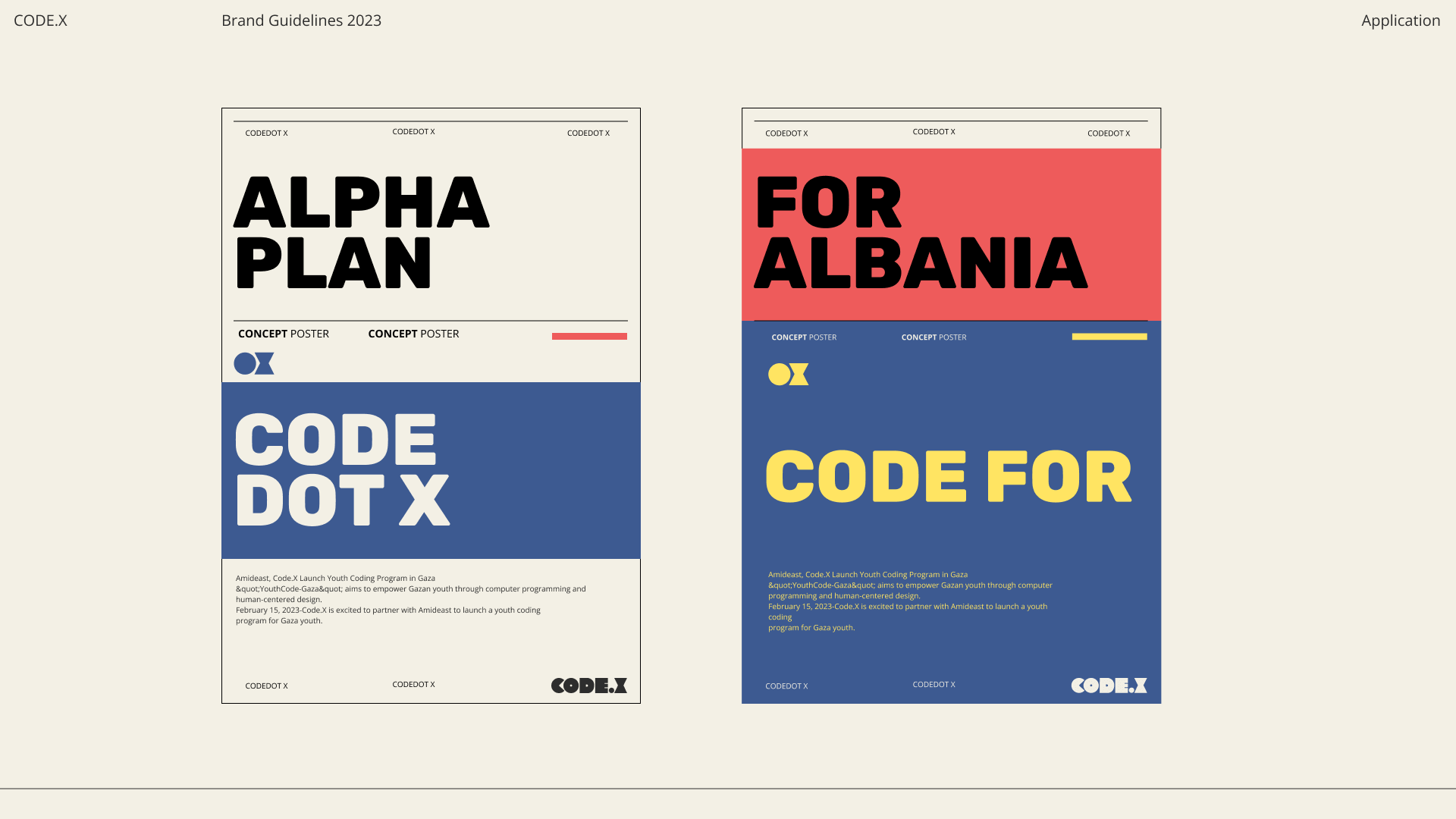
Logo: A flexible, typographic wordmark designed to feel solid and trustworthy, while remaining youthful and scalable across digital and print formats.
-
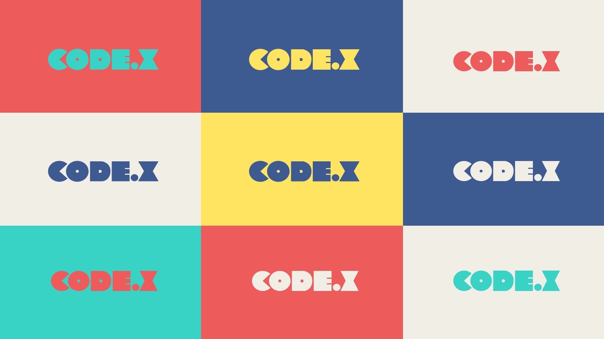
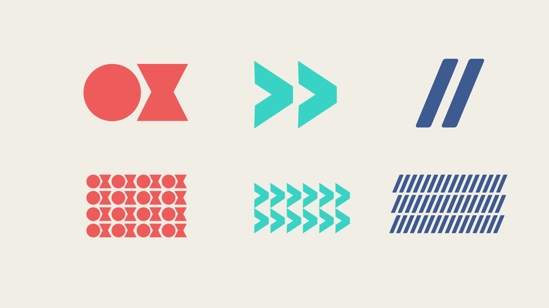
Color: A palette built around confidence and calm—featuring deep blues, earth tones, and a bright accent to signal action.
- Typography: Selected for clarity and multilingual compatibility, pairing a modern sans-serif with a warm serif for longer-form stories.
-
Navigation: Optimized for dual audiences—students and partners—with simplified information architecture.
-
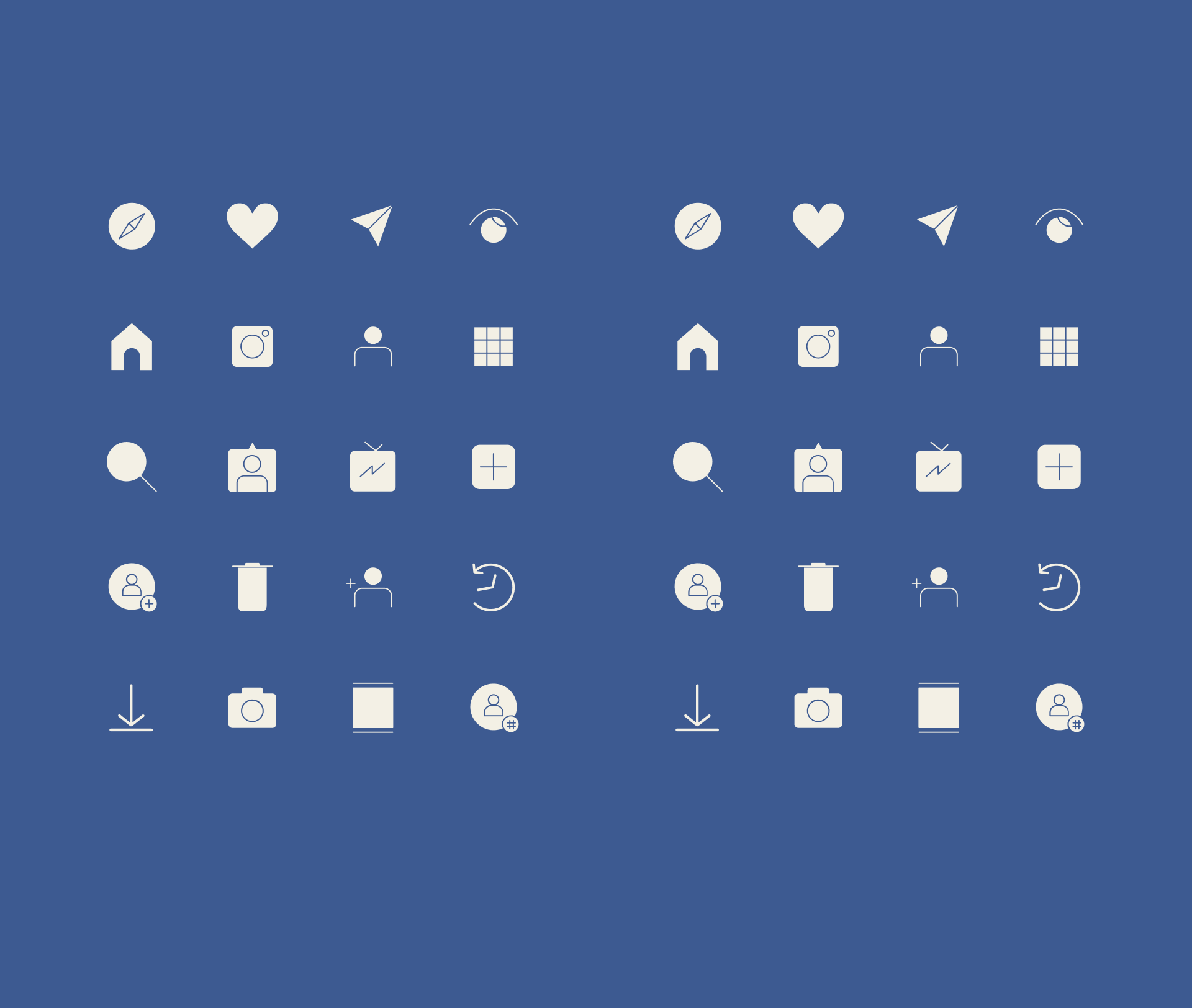
Components: Designed base components like buttons, cards, and testimonial modules to create reusable UI blocks.
- Mobile-first: Ensured full mobile responsiveness, as many students access Code.X from low-bandwidth or mobile-only environments.