Spud
ROLE: UI/UX, USER RESEARCH, VISUAL IDENTITY
TEAM: SOLO PROJECT
TIME: 08.2022–12.2022
TEAM: SOLO PROJECT
TIME: 08.2022–12.2022
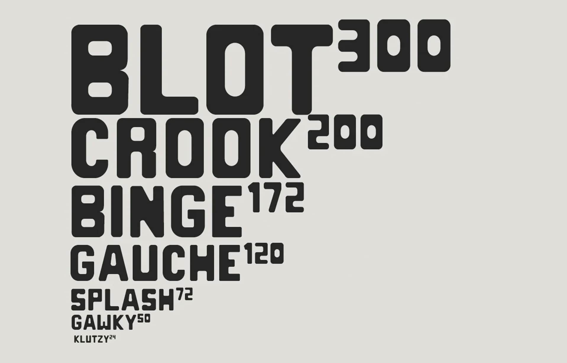
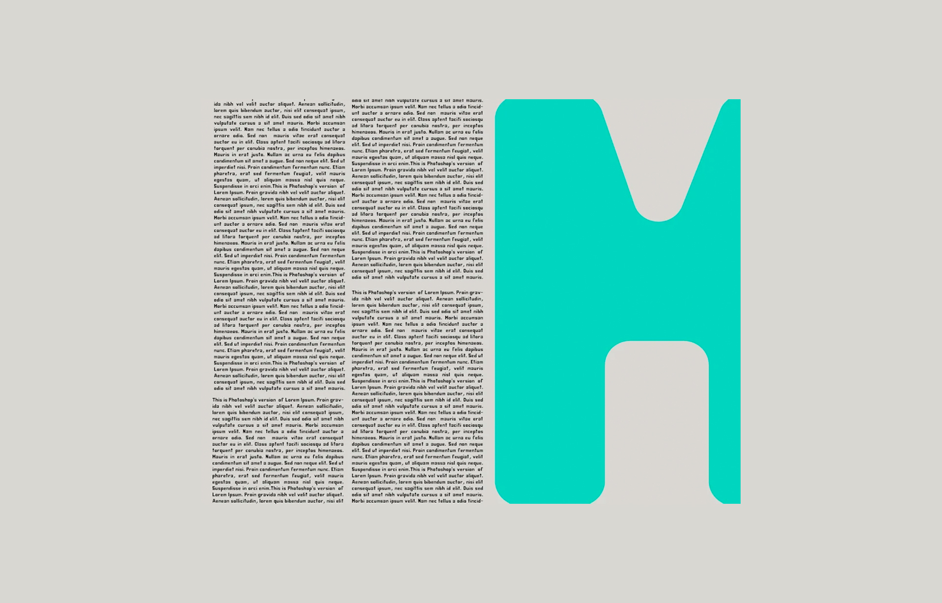
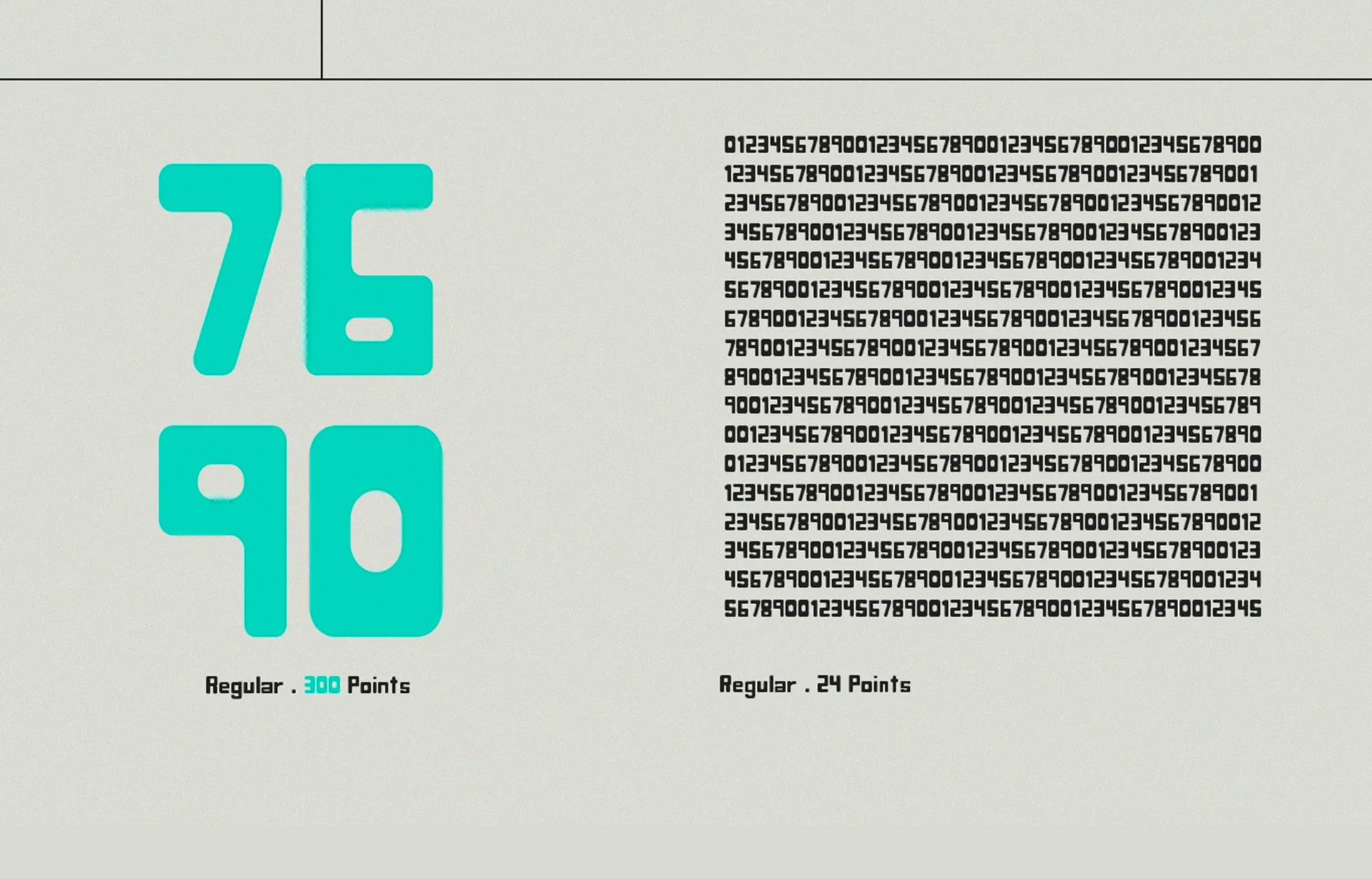
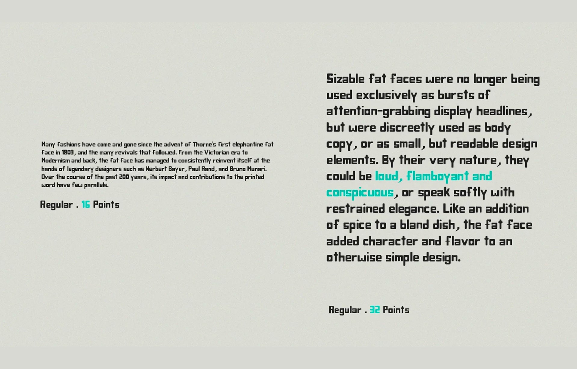
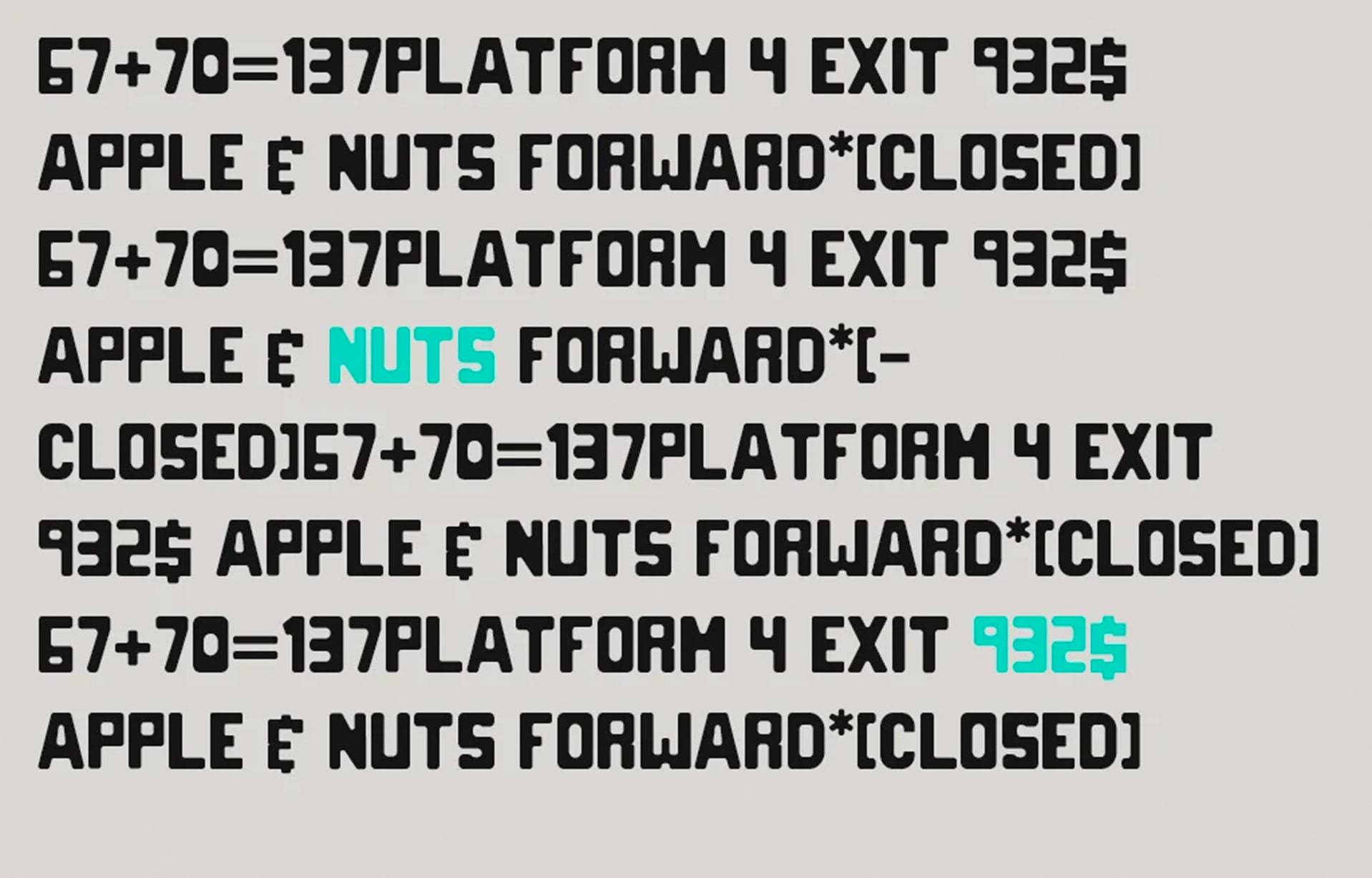
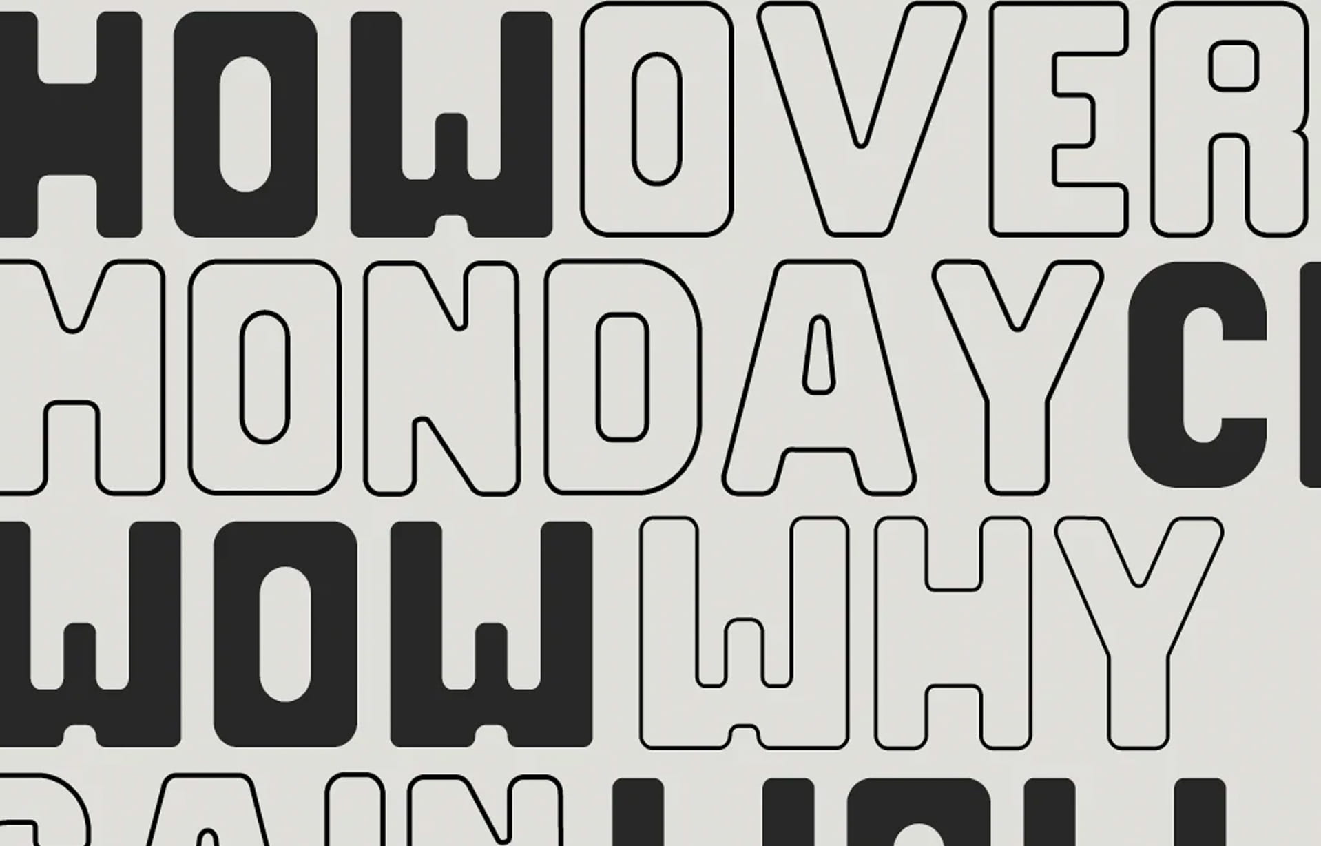
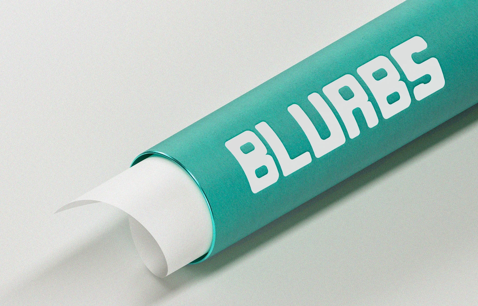
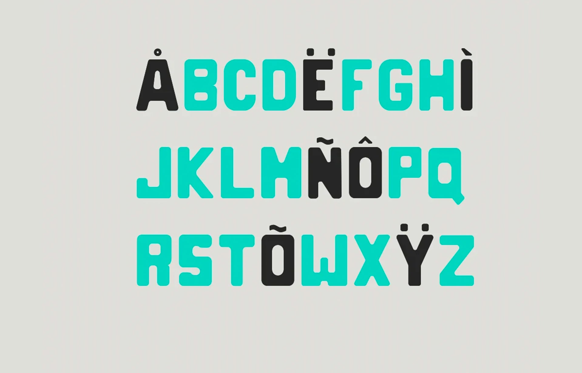
Spud is a typeface which is a loud 21st century render of the 1930s lettering. It is geometric but soft. The blot appearance conveys a friendly and mobile tone which works well for hand crafted products and billboards. It also works well on screens at headline sizes.
Context
CONTEXT
The creation of Spud began in the digital realm using the powerful Glyph app, a versatile tool for type design. With a meticulous eye for detail and a passion for capturing the essence of hand-painted lettering, the designer infused Spud with a unique character that stands out from the crowd.
At first glance, Spud's chubby letterforms make an immediate impact. The bold weight of the typeface exudes confidence and commands attention, making it an ideal choice for headlines, titles, and large-scale designs. Each letter is carefully crafted to embody a sense of energy and whimsy, lending a lively and expressive quality to any composition.
Drawing inspiration from the lively world of painted lettering, Spud embodies the imperfections and organic charm that come with handcrafted art. Irregularities, slight distortions, and playful curves are deliberately incorporated into the design to evoke a sense of spontaneity and creativity.