Paksha/Identity Design/E-Comm/Web
ROLE: VISUAL IDENTITY/ART-DIRECION/PHOTOGRAPHY/PACKAGING/VISUAL MERCHANDISING/SOCIAL MEDIA
TEAM: SOLO PROJECT
TIME: 08.2022–12.2022
TEAM: SOLO PROJECT
TIME: 08.2022–12.2022
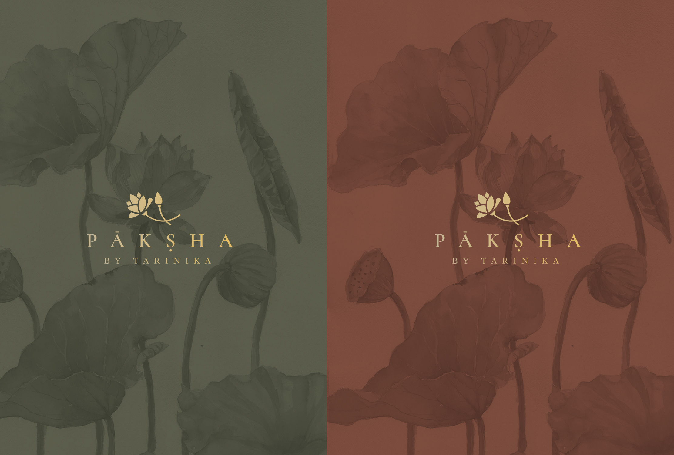
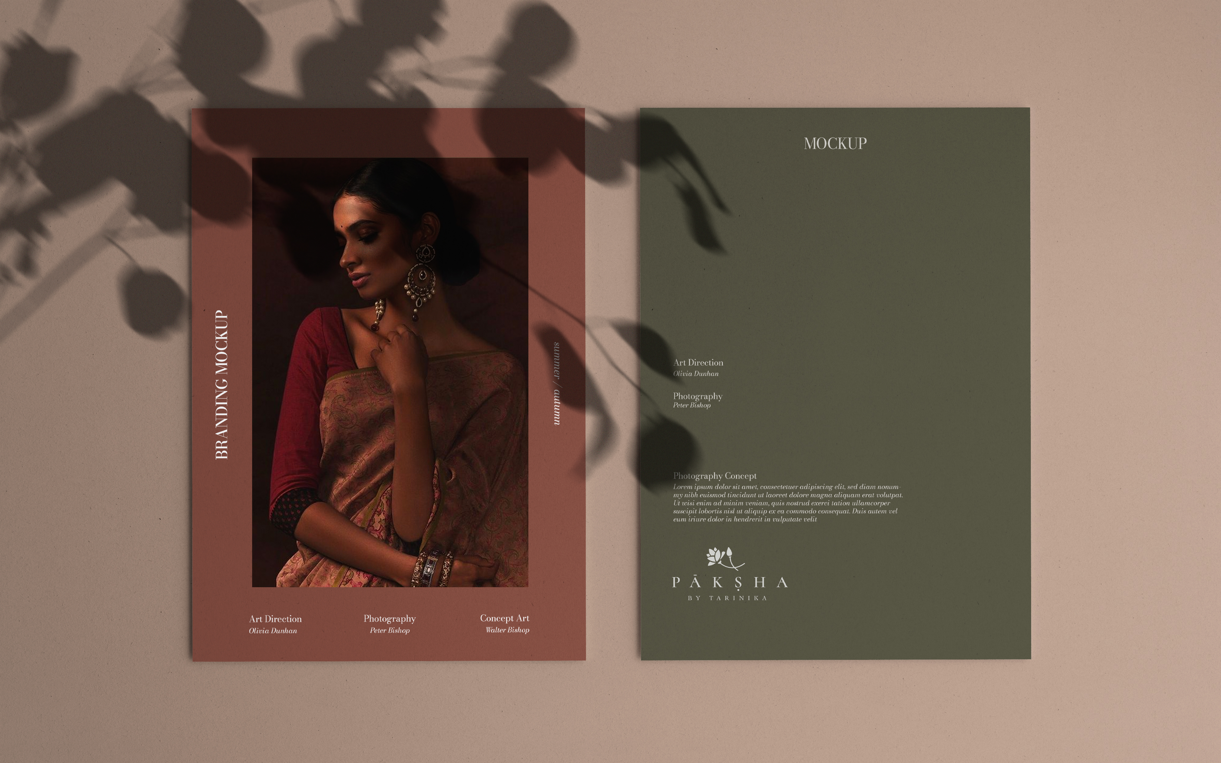
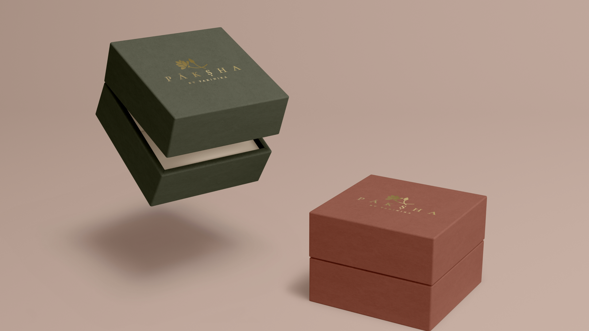
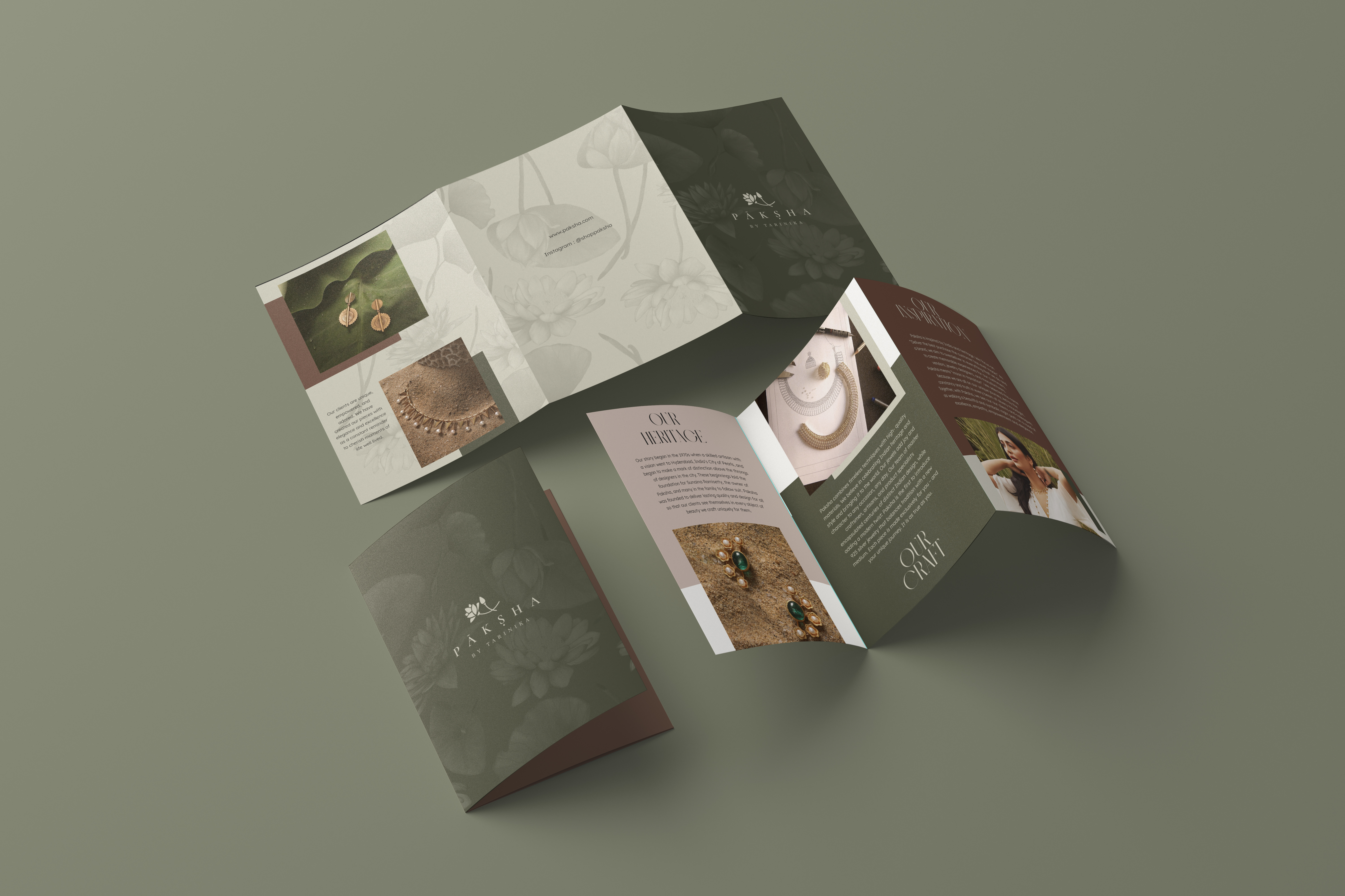
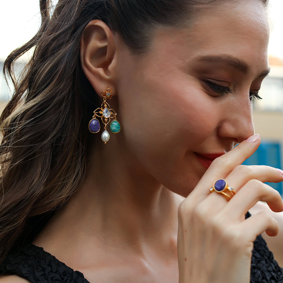
Paksha- a handcrafted silver jewelry brand is inspired by the rich history and traditional motifs of Indian jewelry, the brand's visual identity pays homage to the organic beauty found in nature giving it a contemporary bohemian flair. The logo design reflects the brand's connection to the earth through its use of fluid and graceful lines, reminiscent of the natural contours and shapes found in the environment.
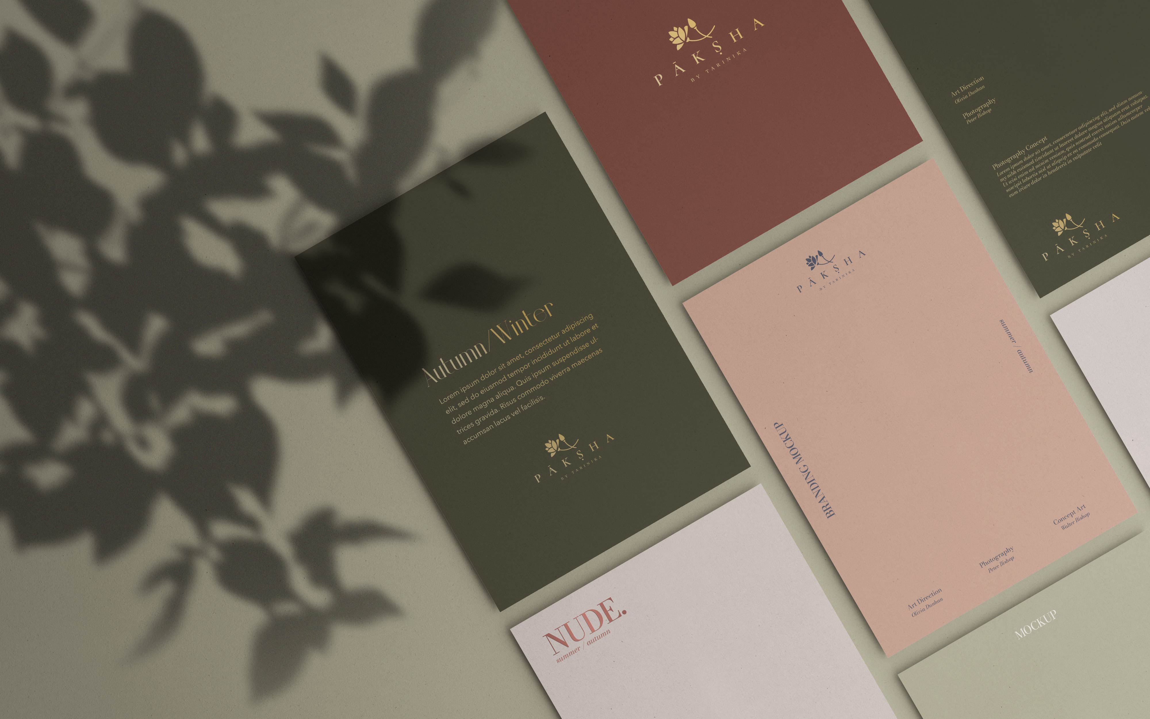
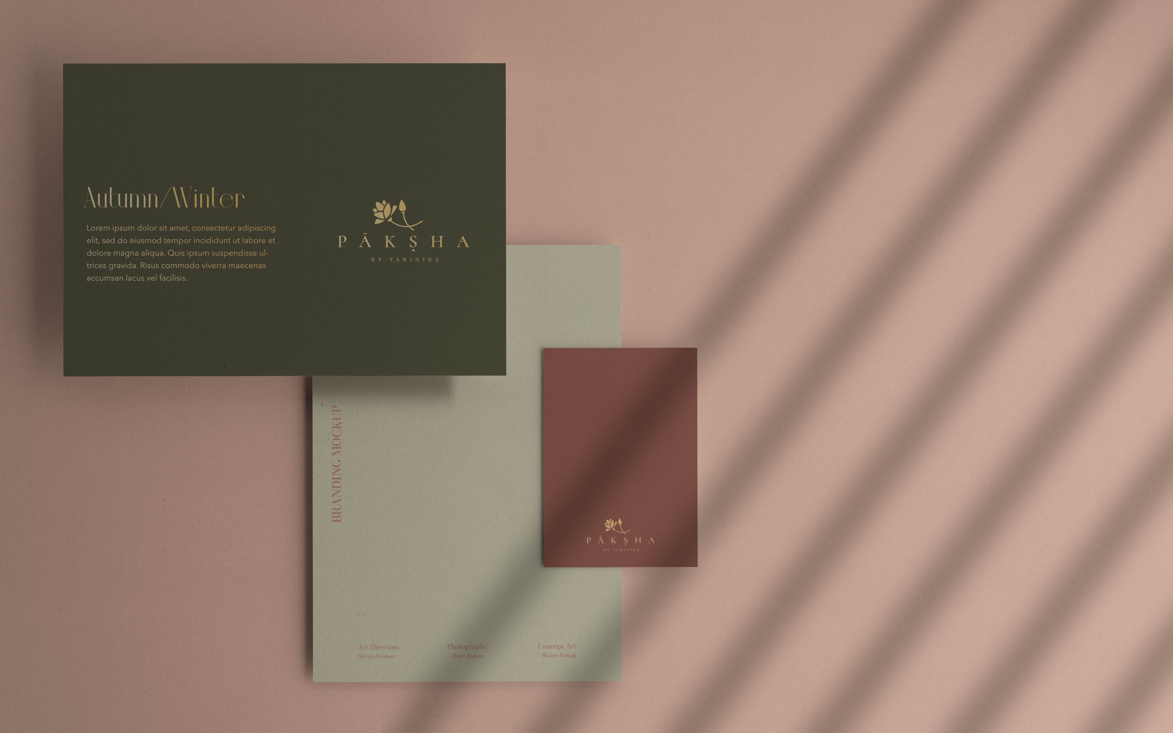
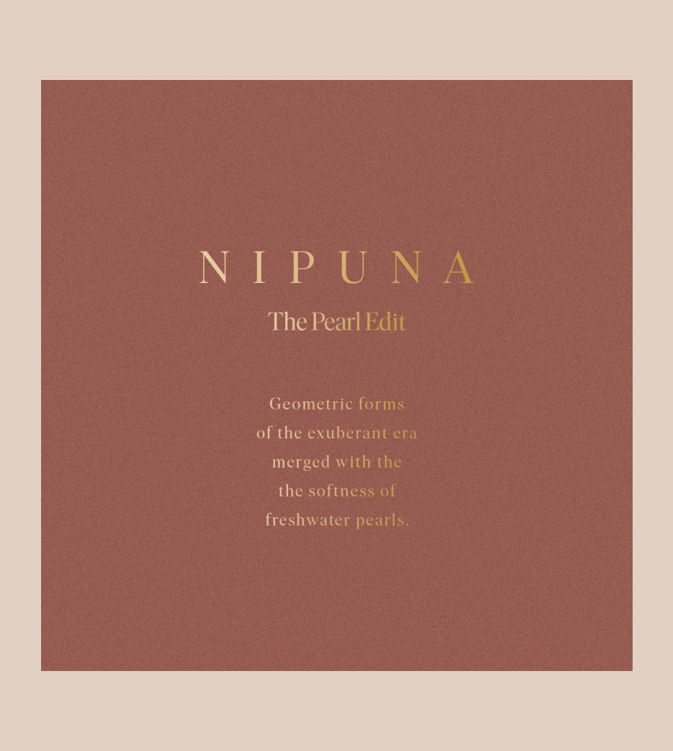
The color palette and typography for the brand draws inspiration from the earthy tones of the Indian landscape mixed with organic lines and luxury. Warm, muted shades, such as deep browns, burnt oranges, and golden hues, are used to evoke a sense of warmth, authenticity, and rootedness. These colors reflect the brand's commitment to showcasing the natural beauty of silver and its harmonious relationship with the earth.
The color palette and typography for the brand draws inspiration from the earthy tones of the Indian landscape mixed with organic lines and luxury. Warm, muted shades, such as deep browns, burnt oranges, and golden hues, are used to evoke a sense of warmth, authenticity, and rootedness. These colors reflect the brand's commitment to showcasing the natural beauty of silver and its harmonious relationship with the earth.
