Tutor O
ROLE: UI/UX/USER RESEARCH/VISUAL IDENTITY
MENTOR: CHUCK ALLISON
TIME: 08.2022–12.2022
MENTOR: CHUCK ALLISON
TIME: 08.2022–12.2022
Tutor Oriel is a new tutor agency for high school and college-aged students that specialises in finding fun and friendly tutors that help students learn. They launched their online flow about a year ago andhave very low completion rates.
They have gotten a lot of complaints and bad social media reviews about how confusing the process is. The business struggling and many tutors want to leave because they are not seeing enough clients.
They have gotten a lot of complaints and bad social media reviews about how confusing the process is. The business struggling and many tutors want to leave because they are not seeing enough clients.
Problem
PROBLEM IDENTIFICATION
They launched their online flow about a year ago and have very low completion rates. They have gotten a lot of complaints and bad social media reviews about how confusing the process is. The business is struggling and many tutors want to leave because they are not seeing enough clients.
HUERISTIC ANALYSIS
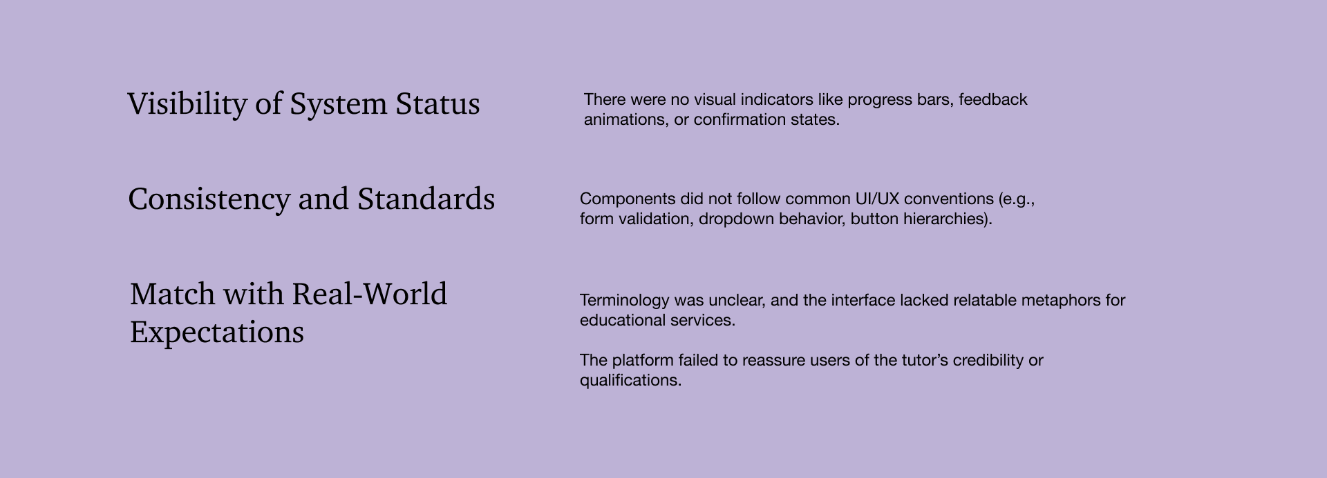
I listed the problems I found and graded them following the Jakob’s 10 Usability Heuristics. There are some problems like writing, some inconsistent buttons, but the two major problems I discover is the inconsistency and no credibility which keep users away. I found major problems with the following in terms of hero user flow of sign-up.
Visibility of System Status: Ensure that users are always informed about the system's current state and any changes or progress made.
Use visual cues, such as loading indicators or progress bars, to provide feedback on actions. Consistency and Standards: Maintain consistency in design, layout, and interaction patterns throughout the website.
Follow established web conventions and design patterns to provide a familiar and intuitive experience.
They launched their online flow about a year ago and have very low completion rates. They have gotten a lot of complaints and bad social media reviews about how confusing the process is. The business is struggling and many tutors want to leave because they are not seeing enough clients.
HUERISTIC ANALYSIS
I listed the problems I found and graded them following the Jakob’s 10 Usability Heuristics. There are some problems like writing, some inconsistent buttons, but the two major problems I discover is the inconsistency and no credibility which keep users away. I found major problems with the following in terms of hero user flow of sign-up.
Visibility of System Status: Ensure that users are always informed about the system's current state and any changes or progress made.
Use visual cues, such as loading indicators or progress bars, to provide feedback on actions. Consistency and Standards: Maintain consistency in design, layout, and interaction patterns throughout the website.
Follow established web conventions and design patterns to provide a familiar and intuitive experience.
Research & Testing
ADJACENT INDUSTRY AUDIT
After finding these major problems, I started to look into adjacent industry to get more idea of what are others in the industry doing. The two main websites I chose is Udemy, Skillshare, Duolingo, Khan Academy to understand what sets them apart and did signup for each of them.
![]()
![]()
INITIAL HYPOTHESIS
To redesign the user flow, branding, and experience to increase onboarding completion rates, improve clarity during tutor selection, and build trust through transparency and visual consistency. The goal was to make the platform feel friendly, intuitive, and responsive—in line with Tutor Oriel's mission of "learning made better."
If we simplify the website's navigation structure, users will find it easier to locate and access
relevant information about tutoring services and course offerings. This hypothesis assumes that the current navigation might be complex or overwhelming, potentially leading to difficulties in finding desired information.
Giving them option to pick a tutor before sign-up and skip the sign-up in between and find the resource.
Giving them more freedom.
Visual Design
A polished and visually appealing design can enhance the brand image of the tutoring service,
conveying a sense of professionalism, credibility, and trustworthiness. Users are more likely
to engage with a website that looks reputable and well-maintained.
After finding these major problems, I started to look into adjacent industry to get more idea of what are others in the industry doing. The two main websites I chose is Udemy, Skillshare, Duolingo, Khan Academy to understand what sets them apart and did signup for each of them.


INITIAL HYPOTHESIS
To redesign the user flow, branding, and experience to increase onboarding completion rates, improve clarity during tutor selection, and build trust through transparency and visual consistency. The goal was to make the platform feel friendly, intuitive, and responsive—in line with Tutor Oriel's mission of "learning made better."
If we simplify the website's navigation structure, users will find it easier to locate and access
relevant information about tutoring services and course offerings. This hypothesis assumes that the current navigation might be complex or overwhelming, potentially leading to difficulties in finding desired information.
If we simplify and streamline the registration or booking process, eliminating unnecessary steps or form fields, users will be more likely to complete the process successfully, reducin abandonment rates and improving conversion rates.
Giving them option to pick a tutor before sign-up and skip the sign-up in between and find the resource.
Giving them more freedom.
Visual Design
conveying a sense of professionalism, credibility, and trustworthiness. Users are more likely
to engage with a website that looks reputable and well-maintained.
Prototyping
LO-FI SKETCHES
After synthesizing feedback from the user survey and completing a heuristic evaluation of the original platform, I moved into the prototyping phase to test and validate the proposed solutions.
After synthesizing feedback from the user survey and completing a heuristic evaluation of the original platform, I moved into the prototyping phase to test and validate the proposed solutions.

Testing & Synthesis
INTERVIEWS AND TARGET AUDIENCE
Through the usability tests, I learned what the target users really want, and what directions they prefer.
I interviewed four people in total, they are people around 20 and 30 who used to work as a tutor before or have experience with a
tutor in the past, it definitely helped me to know more about what users focus more on when they are choosing their own tutor.
I tested my lofi here with this set.
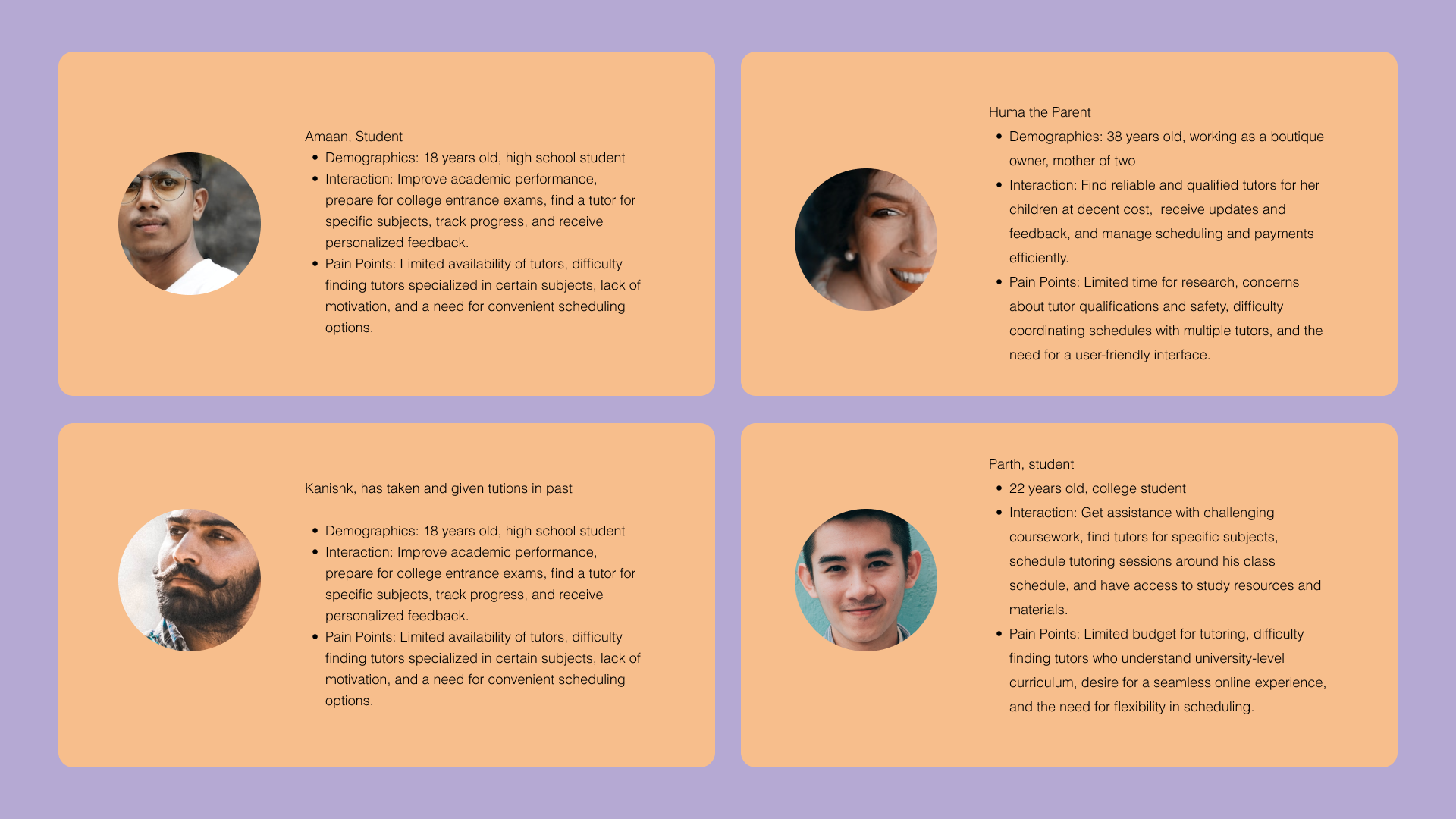
SYNTHESIS
Through the usability tests, I learned what the target users really want, and what directions they prefer.
I interviewed four people in total, they are people around 20 and 30 who used to work as a tutor before or have experience with a
tutor in the past, it definitely helped me to know more about what users focus more on when they are choosing their own tutor.
I tested my lofi here with this set.
︎︎︎Explore opportunities to incorporate personalization features, such as allowing users to save preferences, customize their dashboard,
or receive recommendations based on their interests and learning needs.
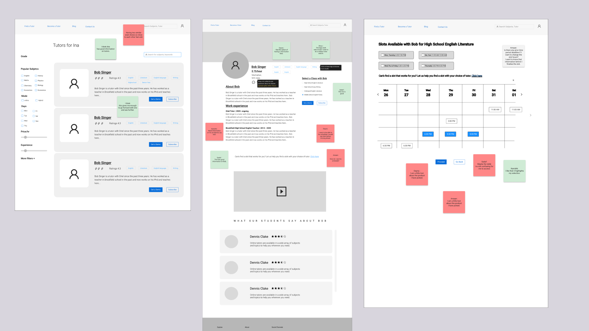
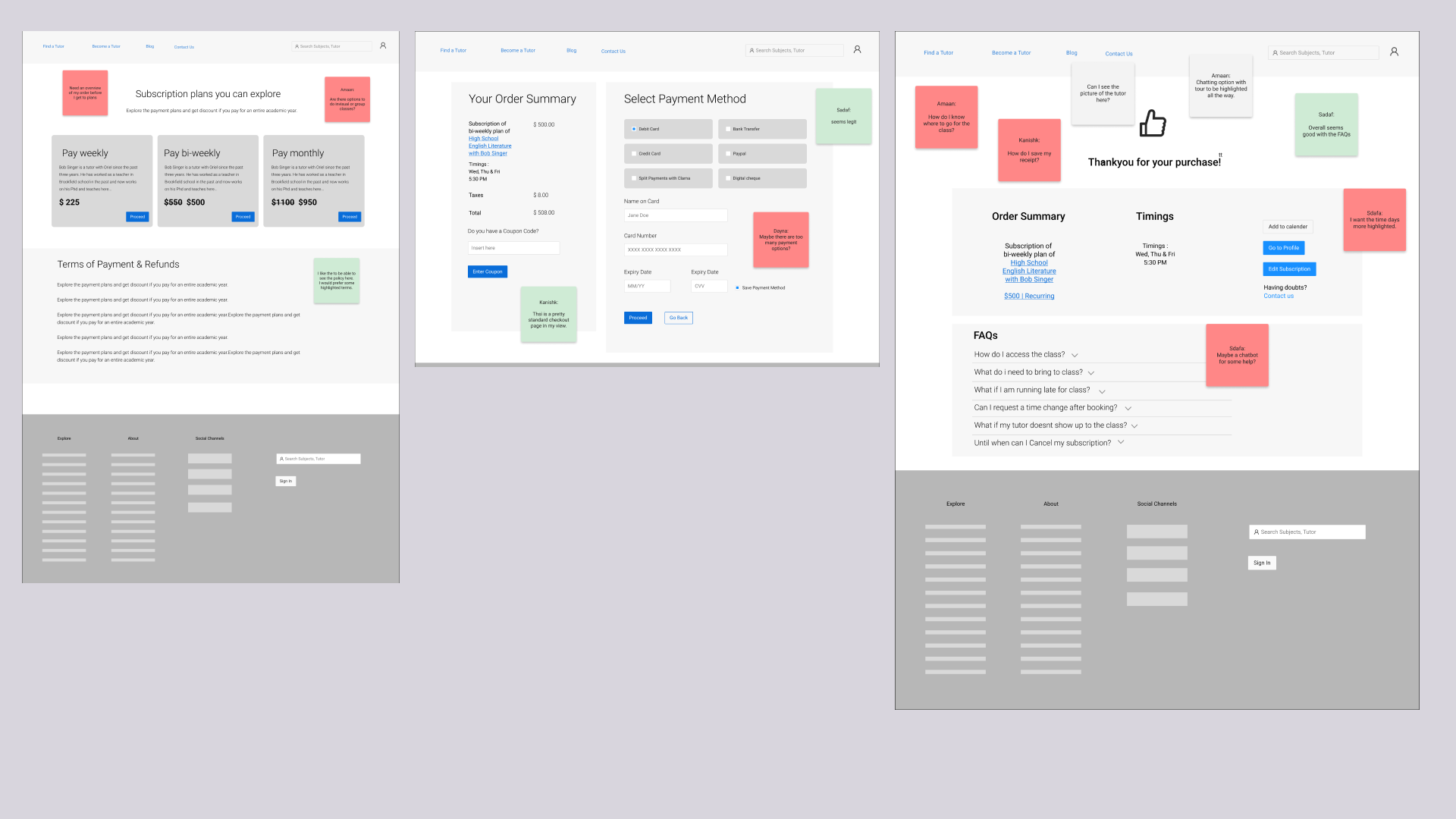
︎︎︎Reworked the booking slot page
︎︎︎Added an option to book class with. a group or indivisually
︎︎︎Added a better way for payment in a weekly and montly way
︎︎︎Got rid off an added info page at sign-up which did not felt relevant to users.


Scoping the product
BRANDING
The color palette consisted of purple, orange, yellow, and white. Purple was chosen to evoke a sense of creativity, wisdom, and
sophistication, aligning with the educational nature of the tutor app. Orange and yellow were incorporated to add vibrancy,
energy, and positivity to the brand identity. The combination of these colors created a visually striking and engaging interface
that captured users' attention. The user interface design followed a clean and grown-up aesthetic. This approach aimed to establish a professional
and trustworthy image for the tutor app, catering to both students and professionals seeking tutoring services.


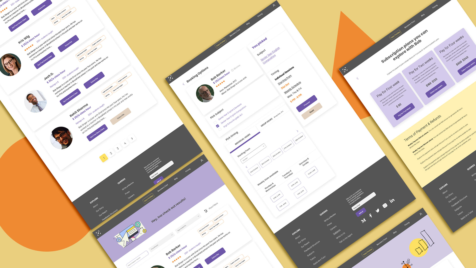
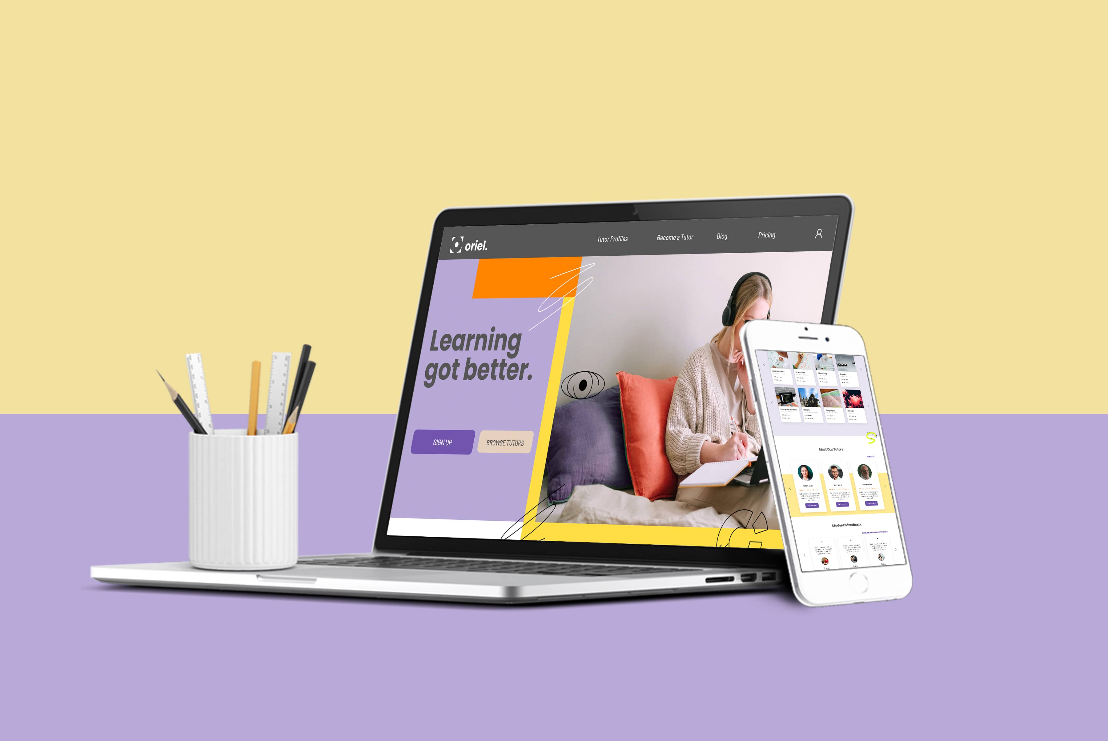
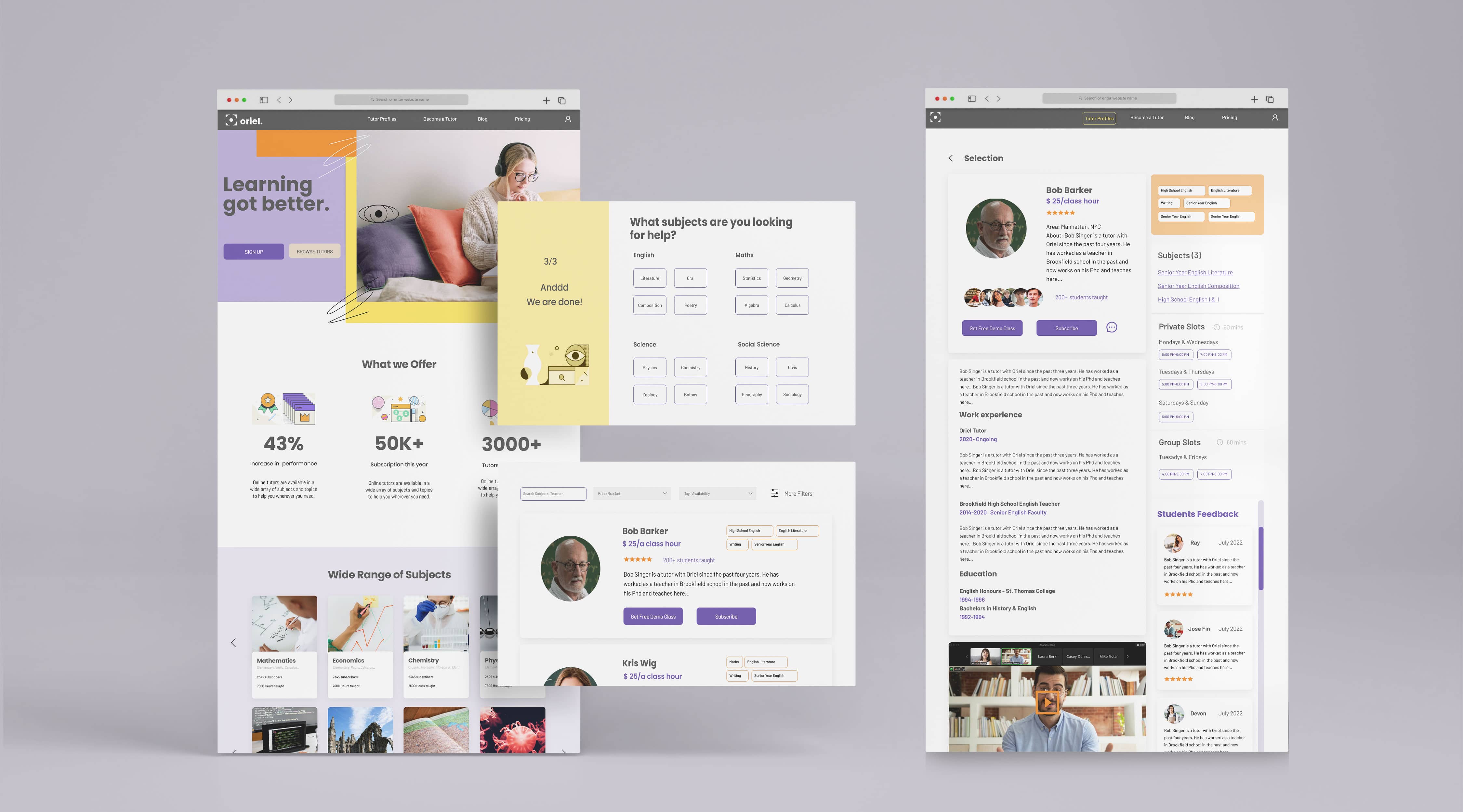
The Product
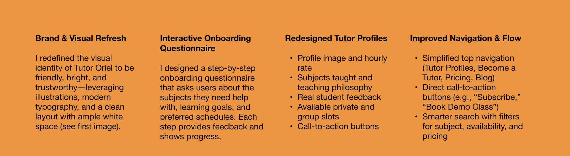
Once the wireframes proved functional, I translated them into high-fidelity prototypes using Figma. These incorporated:
-
A refreshed visual identity with youth-friendly color palettes, rounded UI elements, and hand-drawn iconography to balance professionalism and friendliness.
-
A responsive layout that worked across devices.
-
Visual enhancements like hover states, loading animations, and progress bars to meet visibility and feedback standards identified during the heuristic review.
- An interactive subject selection quiz that made onboarding feel like a guided experience rather than a form.
Outcome and reflection
If launched, the redesign is expected to:
-
Increase onboarding completion rate by 30–40%
-
Reduce drop-off during tutor selection by 25%
-
Increase tutor bookings due to better exposure and clearer profiles
- Improve user sentiment and reduce negative social review